
|
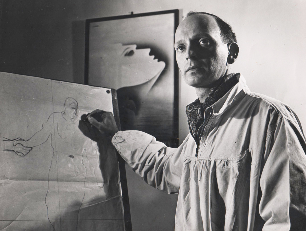
Abram Games
|
Abram Games believed that the simplest designs have the greatest impact. His work employed a philosophy of achieving maximum meaning using minimum means; this approach is characterized in the images produced for FFHC. The Campaign emphasized the need to identify problems and solutions, and the need for grassroots effort to solve a problem of global scale and urgency.
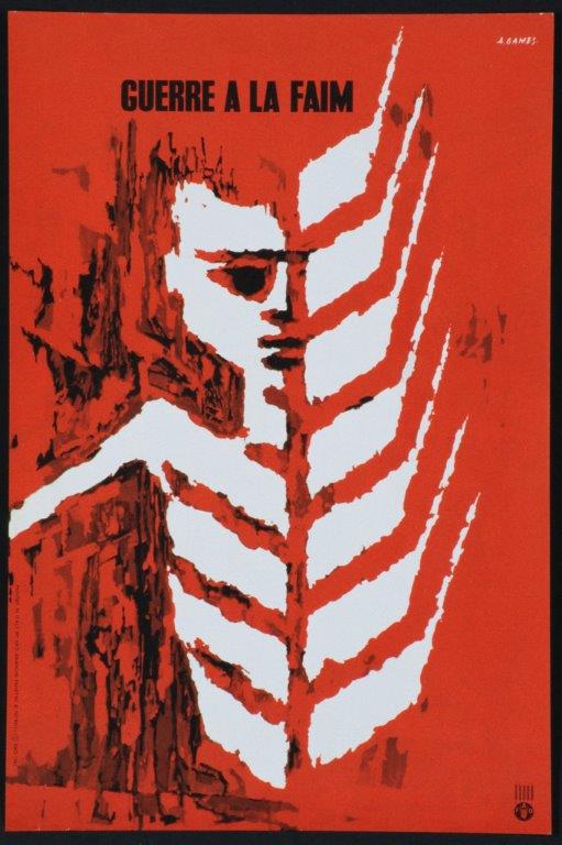
Freedom From Hunger / Guerre a la Faim (1961) used by permission of the Esate of Abram Games and FAO
|
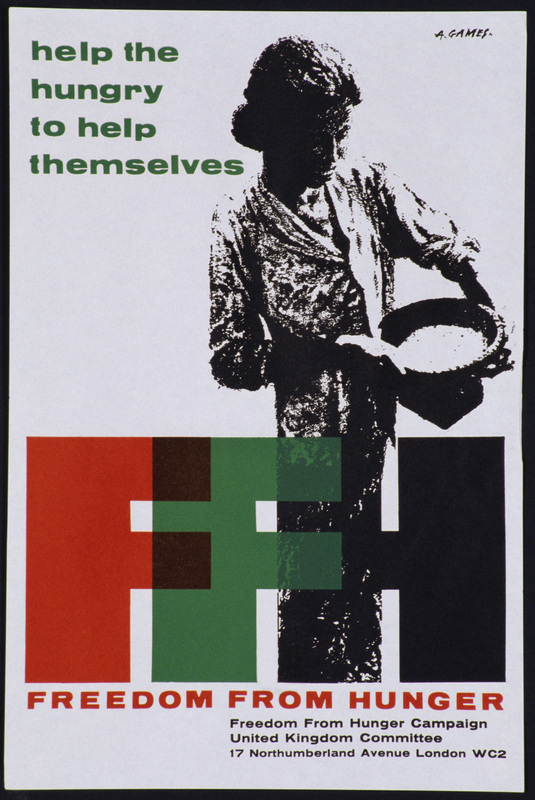
Help the Hungry to Help Themselves (1962) used by permission of the Estate of Abram Games and FAO
|
Progressive drawings for the FFHC posters (below) offer some insight to Games' approach to this work. Games was asked to produce a poster that would convey the purpose of the Campaign, and had met with FAO officials including FAO Director General BR Sen, who took a personal interest in the promotional materials for the Campaign.
Sen said that "[w]hoever designs the poster needs to be a philosopher as well as an artist." Games recounted that "I did over 200 drawings before arriving at the final design. The first sketch embodied everything that the last sketch did, but the challenge was to simplify it so it talked. As with all my posters, the harder I work, the simpler it looks." [i]
With reference to his approach to the work, Games later noted that
"the campaign is aimed at improvements in production and health to combat hunger. Whilst it is true that the accent should be on the positive side, there must be a point of reference to argue its urgency visually. The poster uses the existing state of hunger and symbol for food. Particularisation of food is avoided, since developed countries recognize the significance of wheat.
The problem is to unite hunger and the remedy into a powerful, memorable unit. I believe the design has a simplicity of content which will work effectively towards both conscience, and the intention of the campaign, but without being over-detailed, and so arresting attention. This is what a poster should do.
The poster can be printed in two printings, either in silkscreen or litho, but a third printing for the greys might be advisable. Over a long period it might be a good plan to change the background colour only to a blue, green or ochre, so that interest is maintained. This could be done during the first printing, and posters of each colour sent out as a set. The colour changes could be beneficial in display. Lettering can be over-printed in black in different languages."[iI]
Games recalled beginning the work for the Freedom From Hunger poster in 1960. As envisioned by Games, the poster was printed in four colours and four languages. The second poster, Help the Hungry to Help Themselves, was used by the UK Freedom From Hunger Campaign Committee beginning in 1962.
All drawings ©
Estate of Abram Games
[i] Naomi Games, Catherine Moriarty and June Rose (2003). Abram Games, Graphic Designer: Maximum Meaning, Minimum Means. Aldershot: Lund Humphries.
[ii] Abram Games. Memo. Courtesy the Estate of Abram Games.
[ii] Abram Games. Memo. Courtesy the Estate of Abram Games.
